There is a particular kind of courage required to paint a room — really paint a room. Not the cautious swipe of an accent wall, not the hedged safety of white trim against a moody wall color, but the full, committed, eyes-open decision to submerge an entire bedroom in one deep, luscious hue. Walls. Trim. Ceiling. All of it. One color, absolute and unwavering.
This is color drenching. And it is, without question, the most quietly radical thing happening in interior design right now.
What Color Drenching Actually Means
The term gets used loosely, so let's be precise: color drenching is the practice of applying a single paint color to every surface in a room — not just the walls, but the woodwork, window frames, skirting boards, cornicing, door frames, and ceiling. The effect is total environmental immersion. The eye has nowhere to rest, no white edge to anchor itself against. The room becomes a color field rather than a box of surfaces.
This is fundamentally different from matching your walls to your headboard, or choosing a "statement ceiling." Those are decorating moves. Color drenching is an architectural decision. It dissolves the room's structure into atmosphere.
The technique has deep roots. Sir John Soane painted his London house in ochre and terracotta in the early 19th century. The great English decorator Nancy Lancaster famously installed a butter-yellow drawing room at Colefax and Fowler in the 1950s — walls, ceiling, upholstery, all surrendered to that particular golden warmth. But what was once the eccentricity of confident aristocrats and designers has, in the past five years, become genuinely mainstream. Paint companies now specifically market "drenching shades," interior designers list it as a service, and the aesthetic has colonized every design platform from Dezeen to TikTok.
Why now? Partly because the era of greige — that long reign of grey-beige neutrality — finally exhausted itself. Partly because people spent enough consecutive years at home to develop a real hunger for environments that feel deliberately, consciously chosen. And partly because the visual language of minimalism has become so familiar that its opposite — richness, density, depth — registers now as the more radical and interesting choice.
The Psychology of the Wrapped Room
Before we discuss which colors work best or how to execute the technique, it's worth sitting with what a drenched room actually does to the people inside it.
When every surface is the same color, the architecture recedes. You stop seeing the room as a container and start experiencing it as an environment. This is not a small distinction. A white-trimmed room presents its bones clearly — you see where the wall ends and the ceiling begins, where the window frame asserts itself as a separate element. A drenched room softens all of that. Corners become suggestions. The ceiling lowers (or, paradoxically, seems to float, depending on the color). The space contracts around you in a way that feels, in a bedroom specifically, deeply appropriate.
Bedrooms are meant to be retreats. The word itself implies withdrawal — from light, from noise, from the obligations of the waking world. A drenched bedroom makes that withdrawal physical. You are inside the color. It surrounds you completely. The effect on sleep quality, on the ability to mentally decompress, on the sensation of being genuinely off-duty, is something nearly everyone who has slept in such a room reports feeling, even if they can't articulate exactly why.
There is also something straightforwardly sensuous about it. A room coated in deep teal or warm terracotta or sooty black-green is a room that announces its own desires clearly. It has preferences. It is not trying to please everyone. That quality — the quality of having made a real choice — communicates itself to everyone who enters.
The Colors That Actually Work (And the Ones That Don't)
Not every color performs equally well when asked to cover every inch of a room. Some expand beautifully to fill the space; others curdle under the pressure. Here is an honest accounting.
The Workhorses: Deep Saturates
The colors that have defined the drenching movement are the deep, complex saturates: forest greens, inky navies, burnt ochres, tobacco browns, burgundy bordeaux, dusty plums. These colors work because they contain enough pigment complexity to remain interesting at scale. When you look at a wall painted in a flat, undifferentiated bright red, you see red. When you look at a wall painted in a deep, slightly grayed crimson with undertones of brown and purple, you see a color that shifts as the light moves through the day — bluer in the morning, richer in the evening lamplight, almost black at night.
The complexity is the point. Flat, bright colors are designed to be looked at in small doses, as accents or focal points. A drenching color needs to be livable. It needs to hold interest without demanding attention. Deep saturates — particularly those that have been slightly desaturated or warm-shifted — achieve this.
The Surprising Performers: Dirty Whites and Bone Shades
It would be a mistake to assume that drenching requires drama. Some of the most beautiful drenched bedrooms are painted in the palest, warmest off-whites — antique linen, aged plaster, warm stone. When you apply these colors to walls, trim, and ceiling alike, the effect is not pale. It is creamy, enveloping, almost milky. The room feels made of one continuous material, like the interior of a seashell. This approach is particularly effective in rooms that receive strong natural light, where deeper colors might feel oppressive.
The Colors That Need Care: Pure Primaries and Saturated Brights
Bright, saturated colors — primary reds, cobalt blues, sunshine yellows — are technically achievable as drenching colors, but they require exceptional skill and restraint in the furnishing of the room. When every surface is cobalt blue, even the most neutral sofa reads as a statement. These rooms exist and they are magnificent, but they are difficult. Save them for the skilled or the brave.
The Colors That Struggle: True Greys
Medium, neutral greys — the colors that dominated the last decade of interior design — tend to look flat and slightly institutional when applied to every surface. Grey needs contrast to read as sophisticated. Without it, it registers as unfinished.
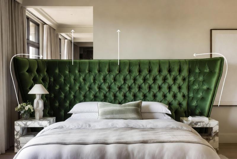
H2: How to Execute a Color Drench in a Bedroom
The practical execution of color drenching involves a few decisions that will determine whether the result feels intentional and luxurious or merely monotonous.
Finish First
The finish — the sheen level of the paint — matters enormously in a drenched room, because you will be using it on surfaces that traditionally get different treatments. The conventional approach (flat on walls, eggshell on trim, semi-gloss on ceilings) exists because different surfaces serve different purposes and take different abrasion. In a drenched room, you abandon some of this logic.
The most popular approach for drenching is to use the same finish across all surfaces: a mid-sheen eggshell or satin that sits between flat and glossy. This unifies the surfaces visually while still providing enough durability on the woodwork. The slight sheen allows the color to reflect light differently at different angles, creating the kind of tonal variation that stops a single-color room from feeling inert.
A more dramatic alternative is to use a higher gloss on the ceiling and woodwork than on the walls — the ceiling and trim become slightly more reflective, catching and bouncing light while the walls absorb it. This creates depth and interest while maintaining the drenched, wrapped-in-color effect.
Preparation is Non-Negotiable
Because there is no trim color to conceal imperfections at the edges and no ceiling color break to forgive a ragged cut-in line, preparation becomes critical. Surfaces must be primed, filled, and sanded to an unusually high standard. The unforgiving continuity of the color will find and expose every patch, every hollow, every uneven line. This is not a technique for corners cut.
The Order of Operations
Paint ceiling first, then walls, then woodwork. This is standard advice, but in a drenched room it matters more than usual because the color sequence needs to be seamless. Use a good quality brush for cut-in lines and a roller for the larger surfaces. Allow each coat to dry fully before assessing; wet paint of a deep color is significantly darker than dry paint, and decisions made while surfaces are still wet will frequently disappoint when the room is finished and lit at night.
Lighting as the Fourth Surface
A drenched room is, in some senses, a room about light. Deep colors absorb rather than reflect, which means artificial lighting becomes the primary source of luminosity. Choose warm-toned bulbs — 2700K to 3000K — that will play warmly against rich, saturated colors. Cold white light in a forest-green room reads as clinical and sad. The same room under the warm glow of a 2700K pendant becomes intimate and extraordinary.
Layered lighting — bedside lamps, wall lights, perhaps a directional ceiling fixture — creates the tonal variation that makes a single-color room feel alive rather than flat.
The Comparison: Drenching vs. Conventional Approaches
Different painting strategies produce different spatial, psychological, and aesthetic effects. This table maps them honestly:
| Approach | Visual Effect | Mood | Skill Level | Cost | Best For |
|---|---|---|---|---|---|
| Full Color Drench (walls + trim + ceiling one color) | Seamless, immersive, architectural dissolve | Cocoon-like, intimate, bold | High | Medium–High | Dedicated bedrooms, rooms with character features |
| Accent Wall Only | Focal point, directional emphasis | Energetic, modern, non-committal | Low | Low | Rental spaces, transitional styles |
| Contrasting Trim (colored walls, white trim) | Structured, crisp, classic | Clean, orderly, traditional | Low–Medium | Low | Period homes, classic styles |
| Statement Ceiling (colored ceiling, white walls/trim) | Dramatic downward draw, jewel-box feel | Playful, theatrical | Medium | Low–Medium | Low-ceilinged rooms, maximalist taste |
| Tonal Variation (wall color + lighter/darker trim) | Sophisticated, layered, cohesive | Refined, curated | Medium | Medium | Contemporary spaces, design-conscious |
| Full White/Neutral | Open, expansive, light-reflective | Calm, clean, neutral | Low | Low | Small rooms, minimalist preference |
| Two-Tone Walls (lower wall darker, upper lighter) | Grounded, historic, graphic | Formal, classic, structured | Medium | Low–Medium | Dining rooms, period interiors |
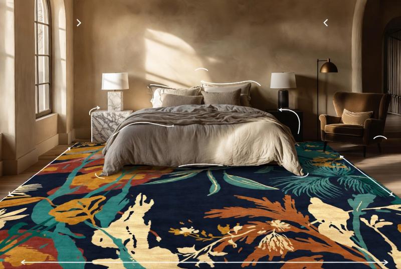
Five Bedroom Colors Worth Committing To
1. Verdant Deep Green
The color that launched a thousand drench projects. A deeply pigmented green — something in the territory of aged botanical specimens, old library walls, Victorian ferneries — performs exceptionally in bedrooms because it reads simultaneously as nature and as luxury. It is the color of growing things and expensive suits. In a north-facing bedroom, choose a green with yellow undertones to maintain warmth. In south-facing rooms, blue-leaning greens work beautifully.
Pair with: aged brass hardware, warm linen bedding, dark walnut or antique oak furniture. Natural materials read particularly well against this color because they reinforce its connection to the organic world.
2. Inky Midnight Blue
The blue that is almost black but isn't — the blue you see at the horizon twenty minutes after sunset. This color creates one of the most genuinely soporific bedrooms available to the modern decorator. Bedrooms drenched in midnight blue have been compared, by the people who sleep in them, to sleeping inside the sky. The color is forgiving of clutter (dark rooms absorb visual noise), flattering to skin tones in warm lamplight, and compelling at any scale.
Pair with: white and cream bedding for maximum contrast relief, silver or gunmetal hardware, soft sheepskin or wool textiles.
3. Terracotta and Warm Ochre
The Mediterranean palette applied to English bedroom walls. Terracotta and burnt ochre drenches are the warmest rooms imaginable — colors that hold sunlight in their pigment and release it slowly through the evening. Particularly effective in rooms that receive western light, which amplifies the golden warmth of these shades.
These colors have the additional virtue of being genuinely timeless. They predate all trends. They will not look dated in ten years the way that trendy neutrals inevitably do.
Pair with: cream linen, natural rattan, soft leather, aged bronze, terracotta ceramics.
4. Deep Plum and Aubergine
The most obviously sensuous of the drenching colors, and historically connected to both royalty and romance. Deep plum is a difficult color to get right — too red and it reads as burgundy; too blue and it tips into cold lilac — but when the balance is achieved, it creates a bedroom of almost theatrical intensity. The writer and decorator Nicky Haslam has long championed deep purple rooms, and the rooms he creates are impossible to forget.
Pair with: antique gilt, velvet textures, deep jewel-toned accents. This color can carry pattern — geometric or floral — without fighting it.
5. Dusty Chalky Rose
The feminine option, stripped of all sentimentality. Not baby pink, not candy pink, but a pink that has been lived in — chalked down with grey and brown until it resembles the walls of an old Italian city. Dusty rose drenches are the surprise of the list: they are somehow both intimate and sophisticated, soft and confident. They work in bedroom spaces of almost any dimension.
Pair with: warm whites in bedding, aged copper fixtures, linen curtains in similar tonal range.
The Arguments Against (And Why They Don't Hold)
"It Will Feel Oppressive"
This concern is almost always a response to imagining a deep color applied to walls alone — the psychological experience of being surrounded by four close-in walls of dark green, say, without the spatial relief of white ceilings and trim. Full drenching actually addresses this problem rather than worsening it. When the ceiling is the same color as the walls, the room doesn't contract downward. It expands outward in all directions simultaneously, becoming volumetric rather than boxy. The eye reads it as an environment, not a container.
"It Will Date Quickly"
The short answer to this is: no more quickly than anything else. The long answer is that deeply saturated, complex colors are actually among the most historically durable in interior design. Rooms painted in hunter green or cobalt blue in the 1990s still look better than rooms painted in the popular neutrals of the same decade. Complexity ages better than trend-driven simplicity.
"It Will Be Hard to Repaint"
Yes. This is accurate. A room drenched in midnight blue requires more coats to cover than a room painted in off-white, and it will need more primer. This is a real consideration for renters and the commitment-averse. For homeowners who have found a color they love, it is not meaningfully more work than any other repaint.
The Furniture Equation
One underappreciated aspect of the drenched bedroom is the freedom it grants to the furniture. When the background is neutral, furniture must create visual interest by contrast — the room relies on objects to generate character. When the background is a strong, immersive color, the furniture can be quieter, more restrained, more functional. The room's character comes from its envelope, not its contents.
This means that a simply furnished room — a good bed, a pair of bedside tables, a wardrobe — reads as intentionally spare and curated rather than under-furnished. The color does the work that furniture would otherwise need to do. This is a significant practical advantage for anyone who prefers living with fewer things.
That said, furniture in a drenched room benefits from texture and material quality. Because color contrast is reduced, tactile contrast becomes the primary source of visual interest. Linen against deep green, velvet against inky navy, rough hemp against warm terracotta — these material juxtapositions create the richness that the room's monochromatic palette might otherwise suppress.
A Word on Textiles and Pattern
The conventional advice for drenched rooms is to keep textiles simple — solid colors in the same tonal family, natural textures, nothing that fights the wall color. This is good advice and generally worth following. But it is not the only way.
Some of the most extraordinary drenched bedrooms layer pattern against the dominant color rather than submerging it. A bedroom in deep forest green with a botanical-print curtain in green and white reads as lavishly, intelligently decorated rather than confused, because the pattern extends and elaborates the room's existing color logic. Similarly, a geometric tile or textile in a contrasting color — copper against teal, cream against terracotta — can anchor a furniture grouping and provide the visual rest point the eye sometimes needs in a fully immersive environment.
The rule is not "no pattern." The rule is "pattern in service of the whole."
Getting There: A Practical Starting Point
For anyone seriously considering a color drench, here is the honest path forward.
Start with a large sample. The larger the better — ideally a full sheet of card rather than a small paint chip. Apply it in several locations in the room and observe it through the full range of light the room experiences: morning sun, overcast midday, afternoon direct light, evening lamplight, and darkness with artificial light alone. A color that thrills you at noon may depress you at 8pm in December.
Then commit. Half measures in a drenched room tend to produce the worst possible outcome: a room that looks unfinished rather than bold. If you are going to drench, you must actually drench — trim, ceiling, door frames, the inside of the wardrobe if it's built-in. Leaving any surface white or off-white breaks the spell completely.
The specific paint you use matters. Cheap paint in deep colors produces streaky, thin, dull results that improve only marginally with additional coats. Quality mattered before; in drenched rooms, quality is non-negotiable. The difference between a mediocre drenched room and a spectacular one is often just the paint.
The Bedroom as Manifesto
There is something quietly political about a color-drenched bedroom. In a design culture that still, despite everything, defaults to neutrality — that still treats white and grey and beige as inherently more "tasteful" than committed color — choosing to wrap your most private room in one rich, unapologetic hue is a kind of declaration. It says that you trust your own responses to color. That you are not decorating for resale value or abstract approval. That you understand the difference between a room that photographs well and a room that lives well.
Color-drenched bedrooms, done well, are among the most powerful spaces in contemporary interior design. They are rooms with interior lives. They have the quality — rare in any designed space — of feeling genuinely inhabited rather than staged. They are rooms that remember what rooms are for: not display, not aspiration, but the deeply ordinary luxury of sleeping, waking, and being somewhere that feels entirely, specifically like yours.
The color is almost secondary. What matters is the commitment it represents. The decision to choose, fully and without apology, and to let that choice saturate everything.